THE BRIEF
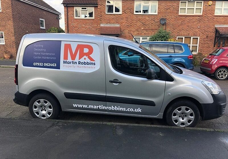
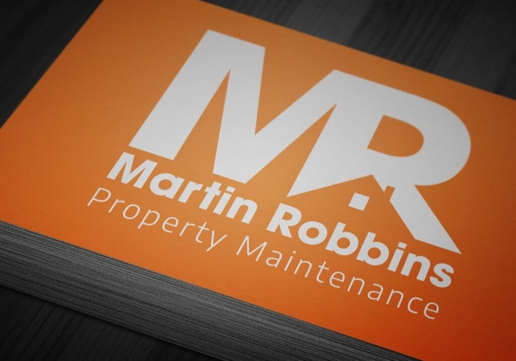
Martin contaced me to create a new logo design for his property mainetenance business. He had been using a logo he had created himself but wasn’t really happy with how it was portraying his business. He knew that he wanted something that stood out on his business cards and vehicle.
THE SOLUTION
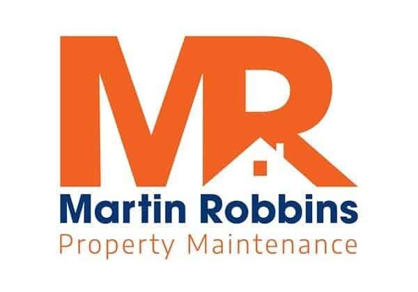
The company covered all areas of property maintenance including painting, decorating, home and garden maintenance. The logo couldn’t really cover all these areas without it being cluttered and confusing. Although using a house icon seemed at first obvious we wanted to make it unique. Using the negative space on the R we created a logo that was memorable to the viewer.
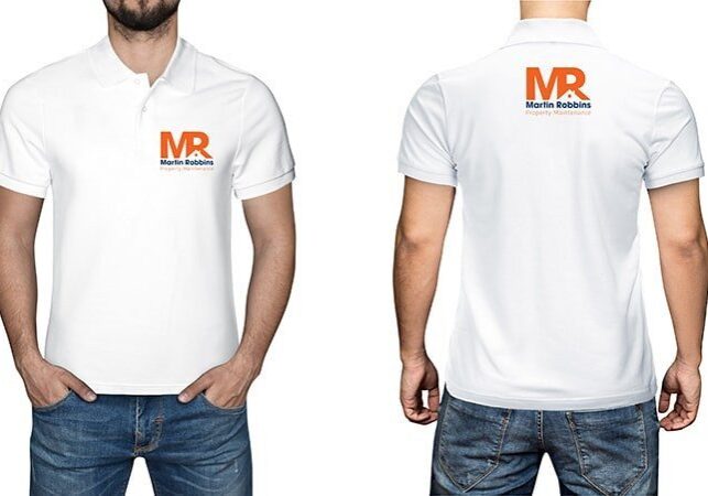
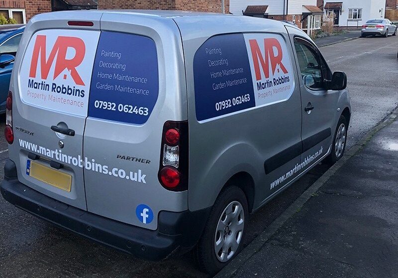
We also created business cards and designed the graphics for Martin’s van. Big thanks to Estuary Signs for the installation.

WHAT THEY SAY
It looks great and it was exactly what I was looking for in a logo and design . You made the whole process very easy. Thank you for all your help.
Martin Robbins, M.R Property Maintenance